Imagine being in a high-stakes executive meeting in an elegant Manhattan office. The air is thick with tension as the men, all impeccably dressed, compare their business cards. It seems like an ordinary scene, but there’s something more—an unspoken showdown, a battle for power, influence, and, most importantly, perception.
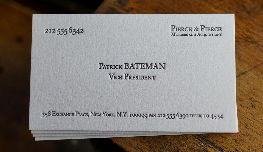
At the center of this scene is Patrick Bateman, the protagonist of “American Psycho”. With a controlled smile and a calculating gaze, he reveals his card. “Bone,” he proudly declares. The paper, the typography, the color—every detail has been carefully chosen. In that moment, his card is not just a piece of cardstock; it’s a symbol of his status, power, and place in the ruthless world of Wall Street.

What might seem like a superficial obsession in the film actually carries a deep lesson that applies to the real business world. Your business card is not just a means to share your contact information. It’s an extension of your professional identity. Just as Bateman and his colleagues fight to stand out in their environment, you too need to ensure that your card conveys the right message.
The Power of a Well-Chosen Typography
Each industry has its own codes and standards, and the typography you choose can say as much about you as the words printed on your card.
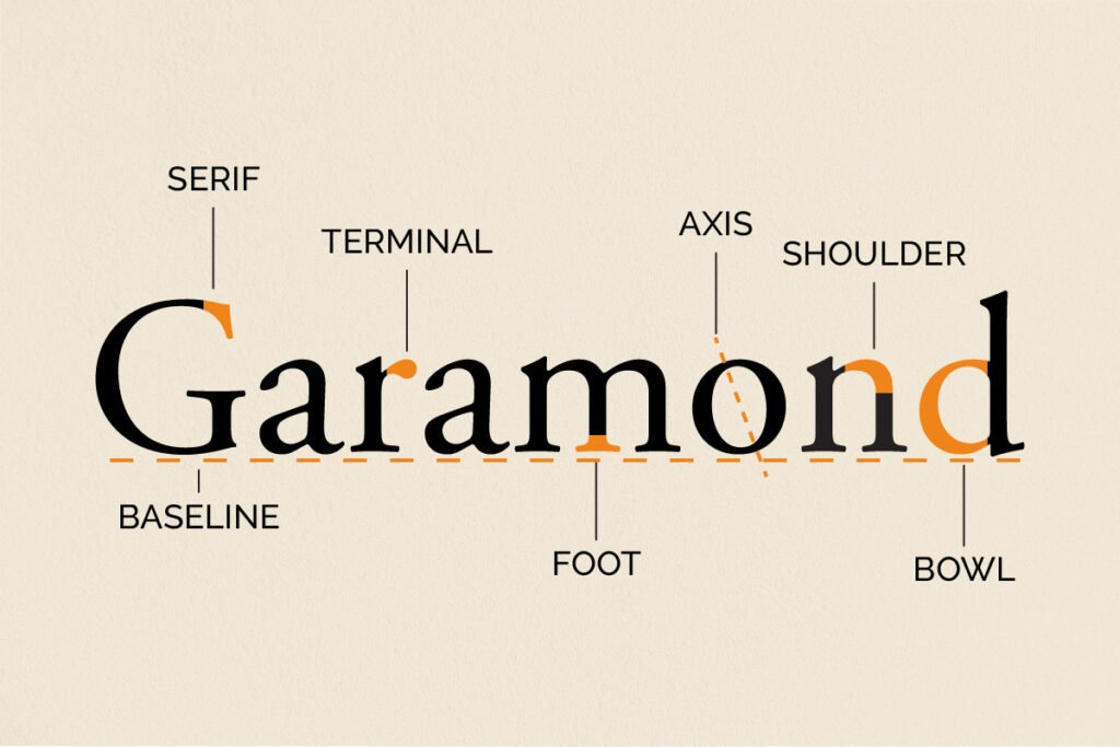
In banking and finance, for example, stability and trust are vital. Serif fonts like Times New Roman and Garamond are popular here because they evoke a sense of tradition and seriousness. Imagine receiving a card from a banker. If you see Times New Roman, you’ll undoubtedly feel you’re dealing with someone reliable and conservative.
On the other hand, in the world of real estate, modernity and professionalism are key. Sans serif fonts like Helvetica or Arial are popular for a reason. Their clean, straightforward design communicates professionalism and focus—perfect for impressing potential clients when you hand them your card during a luxury property tour.

But if we move into the fashion industry, the landscape changes completely. Here, the cards must be as elegant and sophisticated as the garments they represent. Fonts like Bodoni and Didot reign supreme. Their refined lines and sharp contrasts reflect a sense of luxury that resonates with high-end brands. It’s as if the card itself were a fashion accessory.

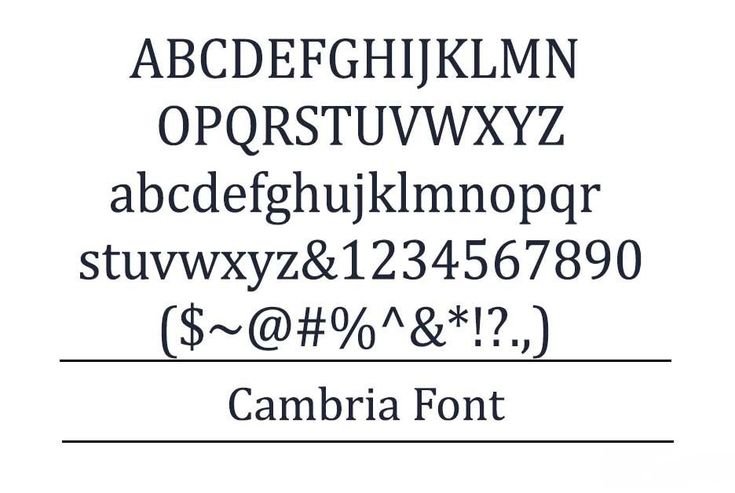
In a law firm or academic circles, precision and formality are non-negotiable. Times New Roman, Garamond, and Cambria are the safest bets, conveying an image of seriousness and professionalism. Imagine receiving a lawyer’s card with a casual font: it wouldn’t inspire confidence at all.
In the field of medicine, clarity is essential. Helvetica and Arial dominate because they are easy to read and do not distract from the important information. After all, in an industry where details can save lives, every word must be clear and precise.

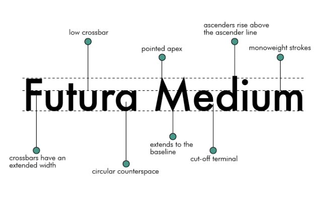
The music industry perhaps offers the greatest creative freedom. Here, a card can be a space to express artistic identity. Fonts like Futura and Avant Garde allow the design to be as dynamic and experimental as the music it represents. Think of a music producer’s card: it should be not only informative but also inspiring.
More Than Just a Simple Piece of Paper
In the end, what the scene from “American Psycho” teaches us is that every detail matters. Just as Patrick Bateman obsesses over the perfection of his card, you too should pay attention to how you present yourself. In the competitive business world, your business card can be the difference between a won or lost opportunity. Choosing the right typography is not just a matter of aesthetics; it’s a powerful strategy for communicating who you are and what you stand for.

So, when you find yourself designing or redesigning your card, ask yourself: What story do you want to tell? How do you want to be perceived? Because, just like in Bateman’s life, in the business world, perfection is not optional—it’s essential.


